

This is part 4 of the Excel for Architects series. You can find links to the other parts of the series here.
Architects are visual people; we love drawings and images. We'll spend hours selecting just the right shade of blue for a colored plan. We'll argue over the proper relationship between door and wall line weights. We tweak our 3D models endlessly to get just the perfect view. Considering how much we obsessively fine-tune our drawings and renderings, shouldn't our spreadsheets look equally good?
Just like drawings, spreadsheets are meant to be read and understood. They are a communication tool. Well-designed spreadsheets not only look good, they're also easy to understand.
Here is a "before" image of a standard program spreadsheet.
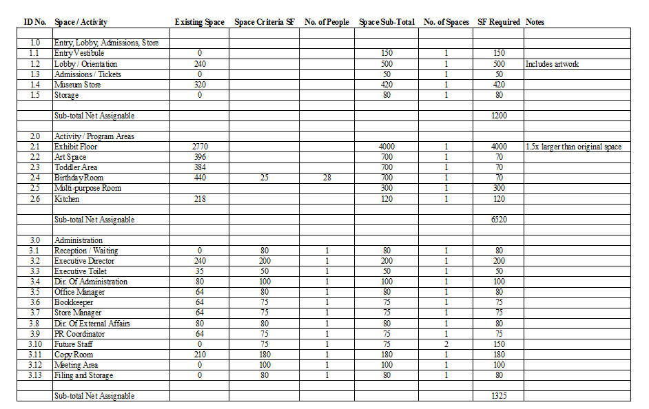
Before image of program spreadsheet.
It's not much to look at, is it? Below are the nine steps you can use to improve the aesthetics and legibility of your spreadsheets. Skip to the end of the post to see the "after" image of this spreadsheet.
1. Choose a good font
Sans-serif fonts (such as Helvetica and Calibri) are always good for presenting data. Always limit the number of fonts you use in your spreadsheet. Stick to one or two at most. A great resource for typography is Butterick's Practical Typography and Typography for Lawyers. Yes, there actually is a site about typography just for lawyers. Also, use a clear hierarchy of font sizes. Important text, like headers, should be larger than sub-headers. Sub-headers should be larger than data text.
2. Align your data
Create a strong edge to your spreadsheet by left-aligning all of your text data and right-aligning your numerical data. This will improve the readability and graphic consistency of your spreadsheet. Don't use center align as this causes the text to graphically "float" in the cell. If you need your data or headers to wrap around the cell, highlight the cells then turn on the "Wrap Text" option.
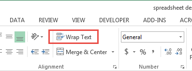
Home > Alignment > Wrap Text
3. Give your data some space
Remember learning about white space in your "Introduction to Design" class? Well, add some white space to your spreadsheet by giving your data extra room by adjusting the column width and height. I know it's tempting to use the Autofit command but it tends to shrink the cell width too much. Instead, set your column widths manually. Use whole numbers and try to keep your column widths as consistent as you can. Also, increase the vertical height of your rows to give your data some extra vertical white space. Simply select all the rows in your spreadsheet, right-click and select "Row Height" from the pop-up menu.
4. Define your headers
The headers of your spreadsheet will help users understand the data you're presenting. Make them clear, legible, and obvious. CAPITALIZE and bold your header text. This is also a good place to add color (but not too much - see below).
5. Choose your colors carefully
Use restraint when adding colors. Consider one or two colors maximum. Choose colors that work well together but still get your point across "; don't just add color for the sake of color. If you need help selecting colors, try Adobe's Color Wheel tool or Canva's Design Wiki on Colors. Complementary colors are always a good choice as are shades of the same color.
6. Shade alternate rows for readability
Consider shading alternate rows with a very light gray or blue tone, particularly if you're displaying many rows of data. Sometimes called zebra striping, this graphic trick helps when reading across a long row of data.
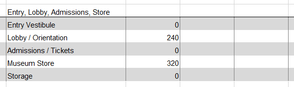
Zebra striping rows in Excel
There are several ways you can add zebra striping to your spreadsheet. The easiest way is to simply change the fill color of every other row. This can be tedious if you have many rows. Another method is to use conditional formatting. See #9 below for more information on conditional formatting and check out this link for how to use it to zebra stripe your spreadsheet.
7. Use Grids Sparingly
Grid lines are great for clearly illustrating the columns and rows of your spreadsheet. Grid lines make it easier to follow the data up and down and left to right. That said, horizontal and vertical grid lines should not have the same line type or line weight. If they do, you're putting too much emphasis on the individual cell and not enough on either the row or the column. Try using a solid line for the row borders and a dotted line for the column borders. If you're using zebra striping, you can just use a solid line for columns and skip the border for the rows. Think of the grid lines as a guide for the reader's eye. Don't make it too difficult for the reader to follow the data.
8. Create cell styles for consistency
Once you've defined the look of your spreadsheet, you can save the settings as a cell style. Simply highlight the cells with the formatting you want to save. In the "Home" ribbon, click the "More" arrow at the bottom of the style gallery.
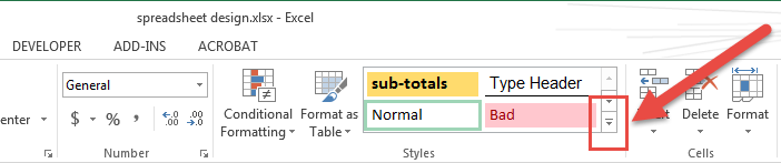
Home > Styles > More
Click the "New Cell Style" button at the bottom of the Custom dialog to open the Style dialog. Give your new style a name and select the properties you want to include in the style settings.
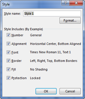
Excel also includes a number of pre-formatted cell styles that you can try out.
9. Use Conditional Cell Formatting
If your spreadsheet contains a lot of data, you can use conditional formatting to highlight values that meet specific criteria. For example, you may want to flag areas in your programming spreadsheet that are smaller than the owner's required area. Similarly, you could use conditional formatting to highlight spaces that are larger in area than required.
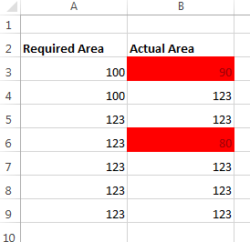
Conditional formatting can be copied from cell to cell using the Format Painter tool in the Home ribbon.
Conclusion
With a little bit of work, you can greatly improve the look and readability of your spreadsheets. Here is the “after” version of the programming spreadsheet.

Same data as above reformatted using the 9 steps
What do you think? How would you format it differently?
Join ArchSmarter!
Sign up for ArchSmarter updates and get access to the ArchSmarter Toolbox, a collection of time-saving Revit macros, Dynamo scripts, and other resources. Plus you'll get weekly productivity tips, webinar invitations and more! Don't worry, your information will not be shared.
We hate SPAM. We will never sell your information, for any reason.
